Burndown Chart - Widget
72 installs, since November 20, 2025. 14 installs/month. Updated December 12, 2025.
Track actual vs ideal progress with Burndown Chart on boards
Our Burndown Chart for monday.com streamlines real-time project tracking. With this app, you get:
1 – Dynamic Visualization:
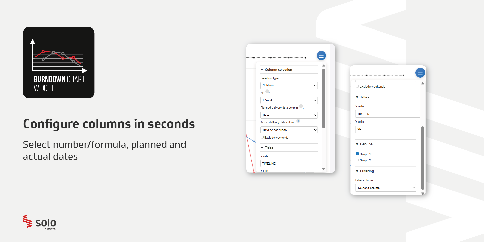
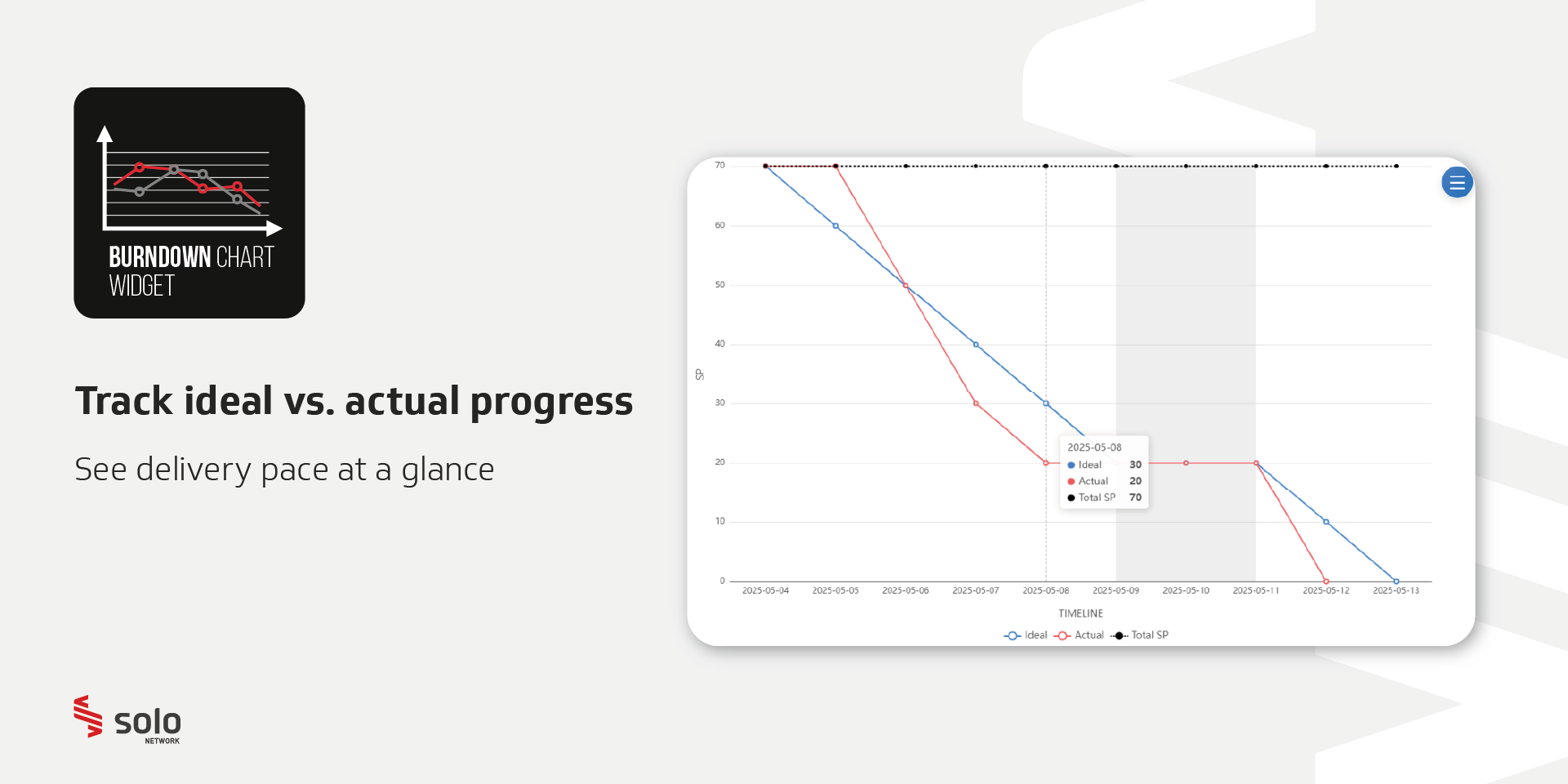
Automatically generate “Ideal” vs. “Actual” burndown curves by selecting any Number (or Formula) column, along with expected and actual delivery dates.
2 – Full Customization:
Edit axis titles, exclude weekends from calculations, and select multiple groups to compare different phases or teams.
3 – Advanced Filtering:
Apply filters using Status, Dropdown, or Board Connection columns — including only the labels or connections relevant to your visualization.
4 – Continuous Updates:
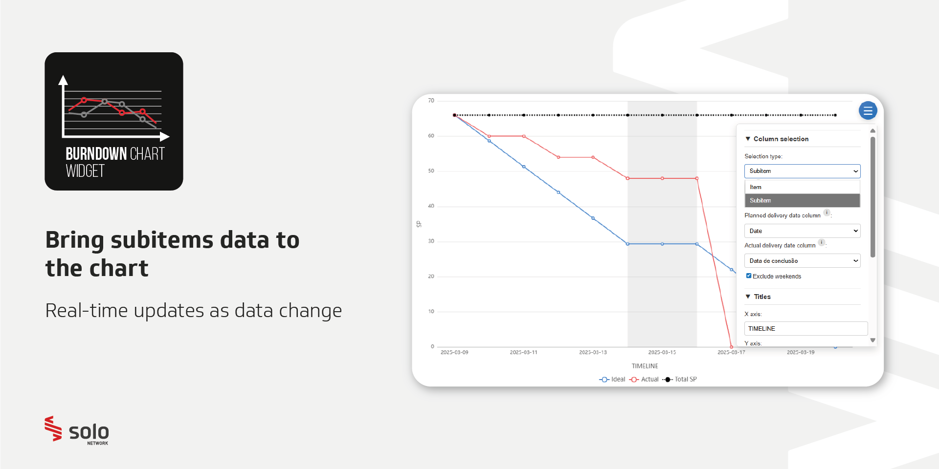
Changes are reflected in real time, ensuring your chart always displays the latest status from your board.
Perfect for agile teams seeking clear visual metrics, our solution speeds up decision-making by showing progress and schedule deviations in one place.
Security & Compliance
The app developer did not provide the security and compliance information for this app.
Reviews
No reviews yet.
Historical data
Installation history
We have data for December 28, 2024 onwards only. Collected sometime after 00:00 UTC daily.
Total number of installs
Change in total number of installs in last 1 day(s)
Compares the number of installs on each date with 1 days previously:
Change in total number of installs in last 7 day(s)
Compares the number of installs on each date with 7 days previously:
Change in total number of installs in last 30 day(s)
Compares the number of installs on each date with 30 days previously:
Change in total number of installs in last 90 day(s)
Compares the number of installs on each date with 90 days previously:
Change in total number of installs in last 180 day(s)
Compares the number of installs on each date with 180 days previously:
Ratings history
Categories history
Each of the following is a yes/no answer, so the graphs show 1 for yes, and 0 for no.


